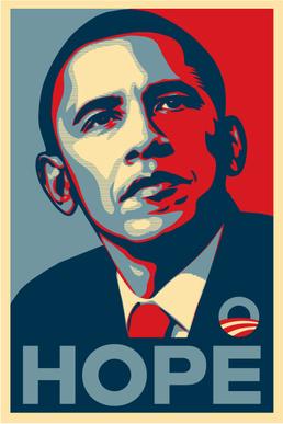
Thursday, November 26, 2015


This is a poster of Barak Obama, current president of the U.S. This poster was created for his presidential campaign. It was also created for the people in favor of Obama and to get voters. I also think this poster was created for the minority in the U.S. especially color people and Latinos. I used to see these posters everywhere in billboards, in stickers, pins and posters. I think the colors are very eye catching; it has warm and cool colors. The font works because it has a very effective word especially the word HOPE since it told a person there’s is hope in voting for Obama. It hasn’t change from its launch date. I think the purpose was intended for the majority of citizens who were affected by what Bush has done.

            The idea was to get people attention and to tell them to vote for Obama. The problem I believe is that not all the citizens might support Obama. Overall I think this poster was a total success since it still appears in the media. Also Barak won that election, especially because most of the minority voted for him. I also the idea resulted great since we has been reelected four years later.


This piece is very famous and very iconic in LA, it’s the Hollywood sign. It functions as a logo to all the Hollywood famous celebrities. This sign is a star by its own since it has appeared in all sorts of media. Its purpose when built was another; it was an advertisement for a real estate company. Due to the great attention caught from the public it stay as iconic piece. The letter form works it has a classical form kind of a square form. This piece has suffered changes before it had the name Hollywood land, now it’s simply Hollywood.  Also it suffer vandalism someone change some words and its read Hollyweed, I saw it on a film some months ago. It did change the meaning because from being a simple advertisement it became a very famous piece.

                The problem might have been how they could keep the piece from suffering any vandalism. Also how the sign could work to get the people to appreciate the sign. I think putting fence and using big size for the sign works, because is visible to our eyes. It also great piece to visit since is accessible to the people. It might be better if they have illumination around the sign for the curious who visit it at night.

Friday, November 20, 2015


I want to write about the Sears Tower that is located in Boyle Heights, where I live. This tower is old it dates from 1927. It’s a nine feet building, which only the first floor is the only one available now. The building is still serves the public, I have recently have gone to that Sears and its pretty big in the inside. In the top of the building we see the name of Sears in a fainted red letter tone. On the bottom floor we see in the center again the letters Sears but in a more animated red. My guess is that the used this tone of color because red always attracts the eye of the viewer. Also the location works because is a much transited place. I heard that this building my get remodel completely, which is much needed.

                The idea for this building was to attract buyers to go inside this big building. I think the problem with this place is that it looks abandoned due to old train tracks are next to this Sears tower. I also think this place needs a bigger parking lot because it gets a lot of customers. I think is a good idea to keep this building since is a very old building but still gets a lot of customers.


The piece I’m going to write about is called the “Griffith Observatory,” which is located in Los Feliz, Los Angeles. The function of this piece is to attract the attention of tourism. Is a very famous place in LA. For people that go hiking to the trials near the Griffith Observatory, get to see this spectacular architecture. Also near the Griffith Observatory we see the Hollywood sigh near from it. This place has been remodel from the inside it has expanded a little from the inside, due to a lot of visitor. In this building we could see a really beautiful view from all LA, and also learn about the universe and look through telescopes the planets. This building has three domes being the center the biggest from the three.

                This place has one problem the building rear is very close the age of a big gap. If there’s a big earthquake while people are inside, could be some scary experience. I think the solution is that they reinforce the concrete to make the building stable for any inconvenience. I think this might not be a solution, therefore there should be cautions or any sign advertising people not to go to the rear of the building. Overall this place is very attractive it looks pretty cool and illuminated during night time.


Tuesday, November 10, 2015

Los-angeles-central-library.jpg


This building is Los Angeles Public Library, which is found here in Down Town Los Angeles. This library is one of the most popular libraries in LA. This building was built in 1872, and is one of the biggest libraries in the world, with many copies available. This library was intended for all people that reside in the community In LA.  I thing that has changed is the size of the library since is one of the most visited in LA. Also due to the population it has to be a little bigger. The building inside contain painted pieces on the ceiling, which gives it more life to the inside of the building.

The problem that might still affect people who want to go to the library is the space access inside the library due to its big crowd. Also another problem might be transportation due to its distance to some people living in other communities. I think a good idea is to make more space and more privacy inside the library. In transportation it will help if there’s more transportation available to people who have difficult arriving to the library.

This architecture is called “Los Angeles City Hall,” this building is found in Down Town Los Angeles. This building was built in 1928. The main function of this building is where the mayor and the city council of LA have reunions. In the 27th floor people could go and observed the view from all over LA. The building has suffer some modification from 1998 to 2001 to reinforce it in case of an earthquake. The building is made from concrete sand for the same purpose to resist any kind of damage. The center part of the building is the tallest around 450 feet tall. In front of the building it has a patio, maybe with the intention of people contemplating the building standing in front of them.

                I think the problem was making the building more solid since is a building that is about 90 years old. I think is a good idea that they due adjustment because we never know what’s going to happen, especially to an old building. I think the idea about maintaining the building is a good idea because this building is emblematic in the LA area. It might improve if they out more lightning around the building because in the inside there’s plenty of it. If there’s lighter it would give the building a sense of illumination.

Sunday, November 8, 2015


This statue is one of the most popular pieces in CSULA campus. Since the statue is of the school mascot is very symbolic. This piece is located in front of the school’s bookstore. I think this piece is great because it shows the eagle in fierce position, imputing it fierce to get what he wants. I think this symbol was intended to motivate the students that pass by the spirit that should be seen around campus. As the eagle show we need to be competitive in our study field. I really like this piece made of bronze because like I said is the school mascot and it’s made of bronze and it’s very well detailed from top to bottom.

                This piece is very successful, because it seen from pretty far distance. This piece is seen by most students during the day, I see it a couple of times every time I’m in campus. I think this piece was designed to show some school spirit. The only problem I see is the size I think the Eagle should have been a little bigger with both wings wide open and the stand a little lower. I think the creator of the statue did right to put it in front of the school bookstore because is a place where people will see it.


This piece is a painting, found in King Hall, in CSULA. This piece is found going to the second level of, King Hall. This piece is pretty big; it covers most of the white space from the wall. I find this piece interesting as a Latino and as an art major. This piece shows a reunion of Mexican figure reunited together in a colorful background. I decided to write about this piece because El Dia de Los Muertos just occurred last week, which most Hispanic consider it their Halloween. We see human skull on the top and right side of the painting. Also we see Jesus Christ on the center which also represents the faith that us the Hispanics have on God. I notice this piece since my first semester that I started attending CSULA. I always see this piece when I go to one of my classes that I have in King Hall.

                I think this piece is really successful, because do to its color and dimension it can’t be unnoticeable. Every time I passed by I enjoy seeing it. Also this piece function where is located since many students and professors passed by this stairways. I think everyone that passes by appreciate this piece due to it covering a simple white big space. I would do any adjustment to  this piece it’s just perfect how it is.  

Friday, October 30, 2015


Last semester I did a group assignment in which my group and I decided to do it in this piece. The name of this piece is, “Corporate Head”, this piece is found in Downtown LA, in South Figueroa. This piece is a bronze statue of a man showing fatigue of his daily routine as a business man. This piece represents the daily life of people who deal with competition in their daily day jobs. I think the main purpose was that to show how sometime people are too involve in their jobs. This was intended for the workaholics. I think the message is clear and it doesn’t change any meaning, you could see a mean leaning from fatigue with his body downwards.

The Corporate head also has a small poem that is relating to the business man that is laying his head on the wall. I think the only problem was the location and what kind of phrase or poem to use for a clear message to the piece. The creator of this piece is a musician and artist name Terry Allen and the creator of the poem was Philip Levine. The Idea is success because my group and I decided to talk about this piece and we found it interesting. It my improve if the statue was raise a little higher and the poem was on top of the figure somewhere were is more visible.

Thursday, October 29, 2015


In this blog I want to talk about the most famous building in LA. The name of this architecture is called the" U.S. Bank Tower" which is located in Downtown Los Angeles. This building gives a sense of beauty to the Downtown area, just looking at immense size and dimension. I have been very close to this building and was impress to have it in front of me. From where I live I could see the glass crown of the building, and at nighttime the crown of the building changes colors. This building was created for businesses, but I think it was also created for the media and people who surround this building. I have seen this building in most of the media, newspaper, television, movies, programs, and internet. I think the color of the surface is simply white, because the glass and the crown glass give some different dimension with blue greenish colors. I think some of the floors have suffered some small changes, but from the outside it hasn’t change a bit.

            I think the main purpose of this building was to have give Downtown LA a representation symbol. They might have taught of creating this marvelous building, for that purpose. Maybe some obstacle was the location or dropping some building that were in that location. In creating this building I think it was the solution because is really one of the symbols of LA. It might improve if they keep maintenances and add some more color to it. Overall this building looks incredible at night with its glass crown shining and giving a colorful meaning to this building the tallest from LA.


Saturday, October 24, 2015


This architecture was made by, Frank Gehry; this piece is named Walt Disney Concert Hall. This architecture is found in Down Town Los Angeles. This place was created in 2003; it was created for mostly adults who enjoy opera concerts. It was created because the widow of Walt Disney wanted to create for events. This place was created for people who enjoy going to musical concerts such as, classical, opera, rock etc. The font has a sort of light that illuminates at night, from the stainless steel that the building was made of. I think they fix the panels from the surface of the building, other than that it hasn’t changed. I think this building is really cool because it makes the building be the focus from its surrounding. Just by looking at it I can see different dimension and a lot of geometric shape.

                I think the problem might have been the material that might have been used. I think the architect and the Walt Disney foundation decided to make the building appearance look different from surrounding buildings, and decided to use stainless steel. I think it’s great because the design and the fonts used outside are fantastic to see. I think it’s doesn’t need any modification I think it looks fine how it is.


Friday, October 23, 2015


This post lights are called Urban lights, this are found infront of the LACMA museum. Last semester I did a research of this work, and I learn it's importance. I learn that this building was design to give LACMA a sense of life at night. This light give a sense of life to an empty night , at Wilshire Blvd. Since it's creator Chris Burden created in 2008, it has been a success. It total of lamps is of 202, with 17 different styles, inspired from the 1920's and 30's. It has been visited from people from around the world, many people takes picture for their own records. Maybe the cost might have been the problem due to the high prize of the cast iron. I think this project was a very good idea it accomplishes are the goal that were settle. It has visitors, it also gives also a sense of life during nighttime.

Sunday, October 18, 2015

LAX LA.jpg

The Theme Building is a iconic architecture found in LA. It's design makes it look like a flying saucer, or a big spider and its four legs. This place is a restaurant where people could enjoy a good dinner, while looking at a nice view. This place was intended to give some life to the airport. I think the size of the building is very precise, since it could be seen from a pretty far distant. This design is pretty cool because it has different lightning fonts, that changes color every often. I think this place is very popular, due to many visitors come and visit it and enjoy it spectacles. I think is purpose didn't change due to is intention was for people to pass by it's location. I think this design is very succesful because it doen't get lost, due to it's dimension and diversity color fonts.


This I found in the school campus. Is the new logo of CSULA. This design is intended for all the people in campus who walked by. It was created for to be a new school symbol. It was intended to be used by the Biological Science building, one of the school most crowded place. The color are the official school colors. The font is pretty noticeable. I thing the main purpose was for the students to identify with the surrounding of campus. The logo change it's meaning because the buildings on the logo represent the most common buildings from LA. The idea was very good because it gives the logo a self identity of how the buildings look in LA.

Sunday, October 11, 2015

Today I found this piece, while I was walking in my neighborhood. What called my attention is the use of color, it has a lot. I really like how the image it's at the center. It's very colorful, and makes my eyes move from one place to another. The only thing I didn't like was the lettering, the tone should be more bright or playful. Overall I like this movie add, I could see action going on.


This piece of art, is found in Dowtown, Los Angeles. I found this piece, while I was with my dad; so I decided to take a picture. I think this piece gives the building a focal point, since the building has a sad tone. This piece takes your eyes into the piece to it's dimensions. I like it because it's a three dimensional piece. It gives a lot of meaning to a simple building. This piece is simple and doesn't have a lot of range of color, but it's really well done.